5 Gestalt Principles of Design
I am currently studying UX design. As you might be aware, I had previously studied design. Hence, I knew some of the principles. However, I never knew the names of the design theory, and one of them is called the Gestalt Principles!
In this post, you can learn more about the Gestalt Principles of Design. You would be able to appreciate what goes behind the scenes when one is designing.
1. What are Gestalt Principles?
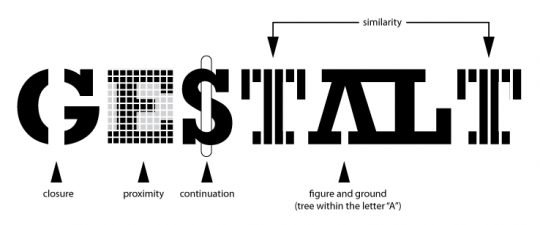
“Gestalt” is German for “unified whole”. Gestalt Principles are principles of human perception that describe how humans group similar elements, recognise patterns and simplify complex images when we perceive objects.
2.
Why designers should care about the Gestalt principles?
When people first interact with your design, how would they experience them? Our human brain tends to order experiences in an orderly and recognisable manner. These principles allow designers to direct the users' attention to specific focal points and take specific actions. We can then create meaning in a complex world. Not only that, the Gestalt principles help designers to design products that are both aesthetically pleasing and intuitive to use.
3. The 5 Gestalt Principles
In this article, we will discuss five Gestalt principles that are commonly found in design. This is not an exhaustive list.
A. Figure-ground
Your brain will distinguish between the objects it considers to be in the foreground or background. It is a form of design that takes advantage of the negative space. Normally, the foreground and background contain two distinct images.
In this famous illusion developed by Danish psychologist Edgar Rubin, you should be able to see two faces and a vase. This is an excellent example of the figure/ground principle.
B. Similarity
It’s human nature to group things together. In gestalt, similar elements are visually grouped, regardless of their proximity to each other. When things appear to be similar to each other, we group them. In UX, we also tend to think they have the same function.
C. Proximity
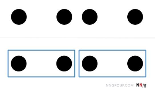
Things that are close together appear to be more related than things that are spaced farther apart. By putting space between the elements, you can add separation even when their other characteristics are the same.
Take a look at the following images. Your brain views them as three distinct groups. In UX design, we tend to put similar features close to each other.
D. Common region
The principle of the common region is very similar to the above principle - proximity. It states that when objects are located within the same closed area, we perceive them as a group. In other words, we include borders to create a perceived separation between groups of objects.
E. Closure
This is my favourite principle. You can easily observe this principle in some logos such as the WWF logo. Your brain can fill in the missing parts of a design or image to create a whole picture. Take a look at the WWF logo. We can see the panda, even though the outlines are non-existent.
You can easily observe all of the above principles in design, from websites to newspapers. You can improve your user experiences by applying these principles to your work. Some of these principles are relatively easy to use too.
I hope you have learnt more about the Gestalt Principles of Design.
x, Esther
Liked the post? Take a second to buy me a coffee.


