Squid Game - Design and Colour Study
The South Korean drama - Squid Game - has become Netflix's most popular series yet. I was drawn into this drama due to the design of the sets. It was too colourful and cheerful for the bloody scenes. In this post, we will study the design of the scenes in the drama.
Spoilers alert! If you have not watched the drama, you may want to watch it before reading this post.
You can watch this video to have a better understanding of the design of the sets and scenes.
In the title of the Squid Game, you can see the basic shapes in design: circle, triangle and square. You can observe these shapes on the masked men too.
Credit: Netflix - Squid Game
All the crews wear the same uniform in the Squid Game. The workers and players are wearing different colours. The art director drew inspiration from the ant, as she wanted them to look alike, with only one differentiating factor. Hence, shapes were used as labels. The players are in tracksuits. If you had checked out the drama, most of the games require them to do strenuous exercises.
Circle - Refers to the Workers
Triangle - Refers to the soldiers
Square - Managers
Man in Black - the Frontman
The colour, pink and green, are the opposite of the Colour Wheel. Hence, the colours look balance on the screen.
Credit: Netflix - Squid Game
If you watch the drama closely, you will realise that the primary colours used are pink and green. If I am not wrong, the secondary colours are blue and yellow. This is the colour palette that was implemented in most of the sets. The palette gives off a playful vibe. You can easily spot these 4 colours in the playground set.
Credit: Netflix - Squid Game
The playground is my second favourite set. The playground equipment was made bigger than usual. This illusion allows the players to reminisce about their younger days as a child. These architectures were once bigger than them.
Credit: Netflix - Squid Game
The most impressive set of all is the staircase. The inspiration was drawn from "Relativity" by MC Escher. As you can see, the stairs are pained with pink, yellow and turquoise (a mix of blue and green).
In the following few scenes, you can also observe these colours.
Credit: Netflix - Squid Game
Credit: Netflix - Squid Game
Look at the lightbulbs. You can see blue, yellow, red and green. A warm light (yellow) was used by the side of the bridge and the suspension rope. Yellow is a good contract against the black background. Yellow was used as an accent in the Glass Bridge game, Tug-of-War and the giant Piggy Bank.
Credit: Netflix - Squid Game
Credit: Netflix - Squid Game
Credit: Netflix - Squid Game
Yellow was used to emphasise the giant piggy bank. Doesn't it somehow look like a piggy bank filled with gold? In this context, yellow represented extravagance, wealth, riches, and excess.
Credit: Netflix - Squid Game
Credit: Netflix - Squid Game
In this scene, warm light was used instead of white light. Initially, I thought that white light would be a better choice. However, if white was used, it would look like a technology or futuristic scene. Hence, it would not suit all childhood games.
On an unrelated note, I like this mask! The mask ooze mystery and authority, especially when he stood beside all the workers in pink. It makes the frontman more humane than the rest of them, who are just acting out the orders.
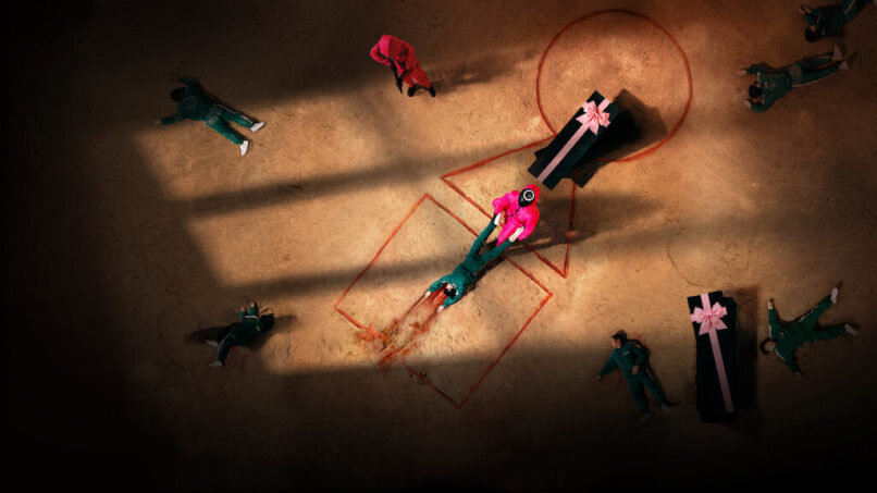
Next, the black coffin with a giant pink ribbon. If you watched the Youtube Video which I included in this post, the Art Director - Chae Kyung Sun said that the aesthetic of the coffins is to match the potential logic behind the game creator's thought process.
This is my gift to you. Even your bodies being disposed in the incinerator is a show of my mercy.
— Chae Kyung Sun
This thought is so interesting!
Who knows more coffins with ribbons will start appearing for all the dead characters in computer games or real life?
Credit: Netflix - Squid Game
Do you see the basic shapes?
x, Esther
Liked the post? Take a second to buy me a coffee.
If you like this post, share it with the world!


